DROPS OF GREECE
A Manifesto for Living Life to the Fullest
An ode to:
Skin minimalism.
Freedom.
Exploration.
Every drop of Drops of Greece is alive - intentional, essential, and unapologetically modern.
THEMATIC: Brand identity , Brand strategy, Clarifying Vision
WHAT WE DID: Co-founding, Head of Marketing, Creative direction, Brand Identity, Visual Identity & Packaging, Brand Strategy, Naming, Copywriting.
Beauty / Skincare Industry • 2020-2025 Year
-
Years of work with beauticians, skincare experts, labs, and pharmaceutical companies shaped our understanding of skin. Innovation, R&D, trends - we’ve been there.
Drops of Greece was the natural next step.
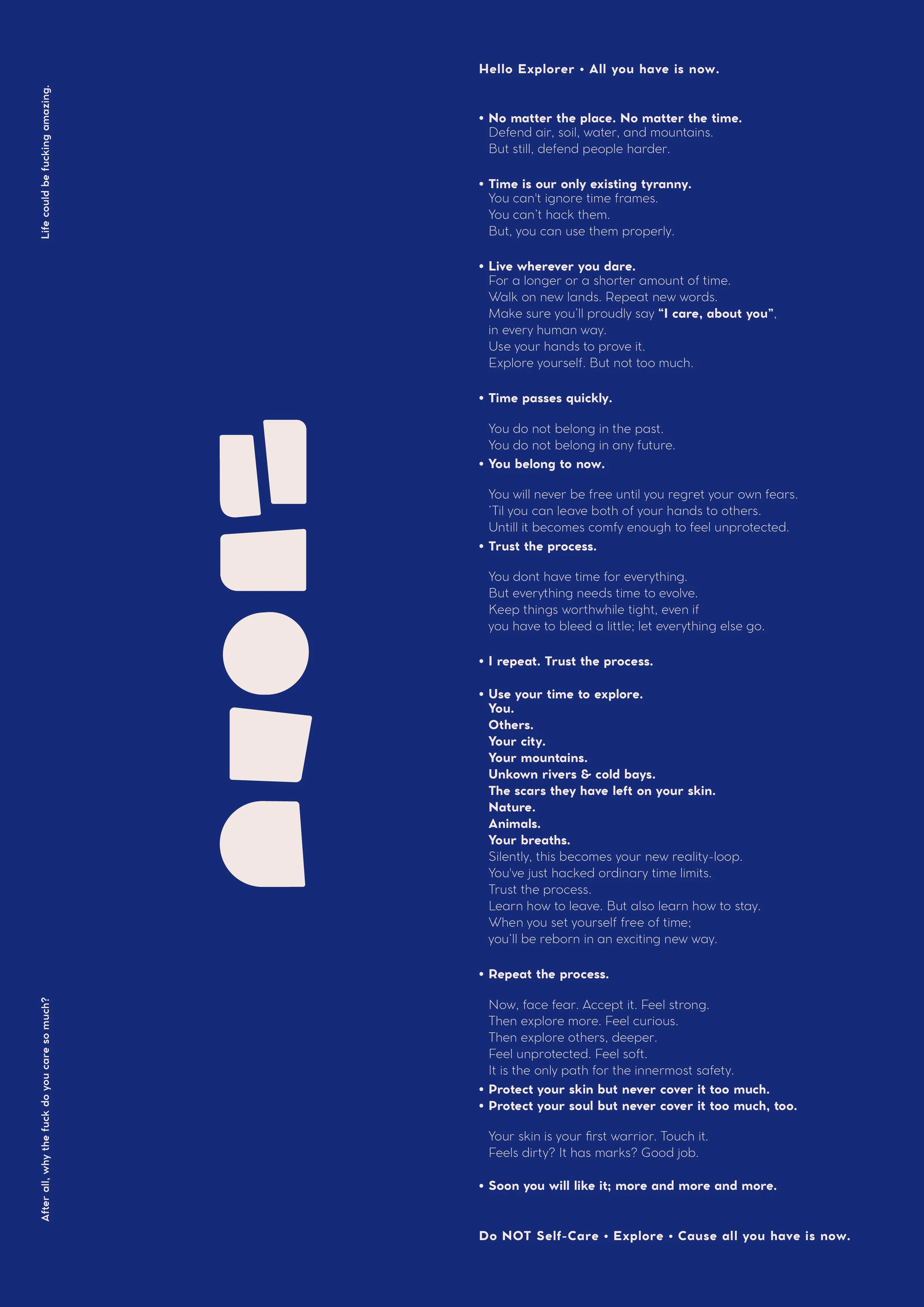
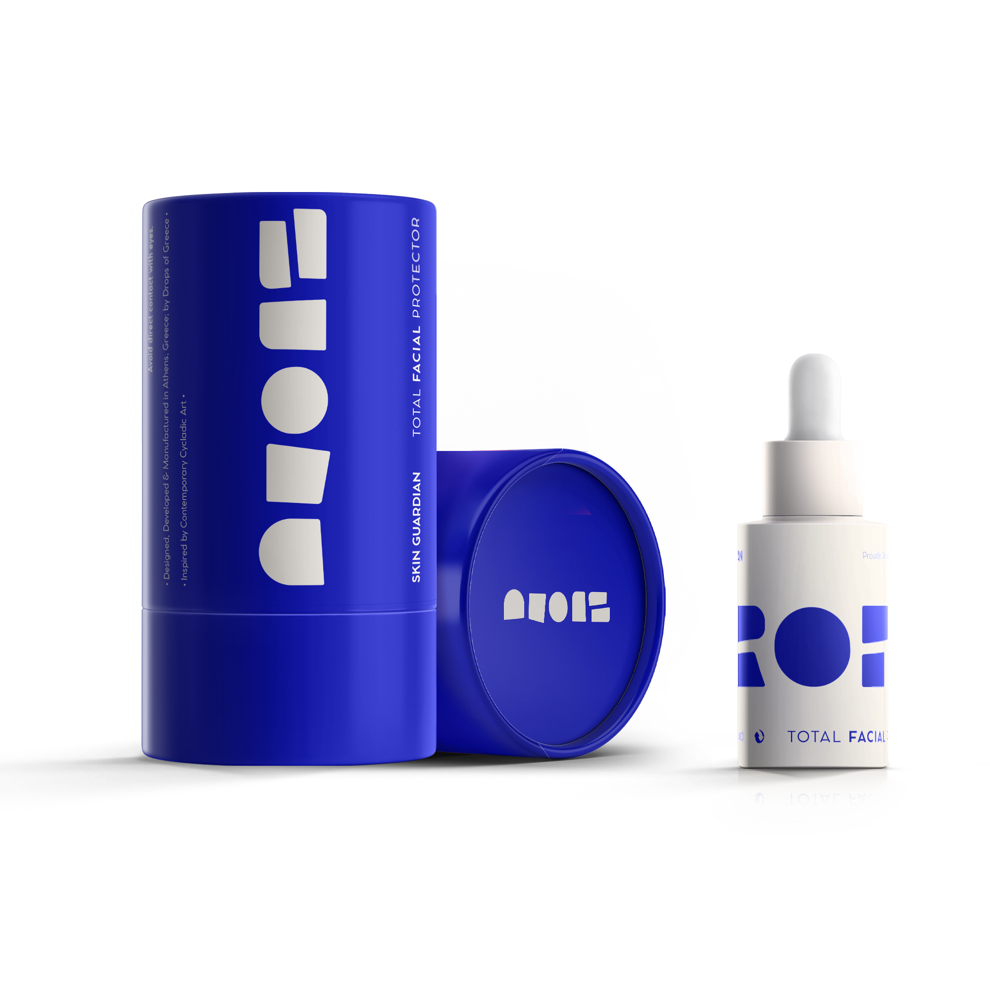
A contemporary skincare brand designed, developed, and manufactured in Athens, Greece.But this is not just skincare.
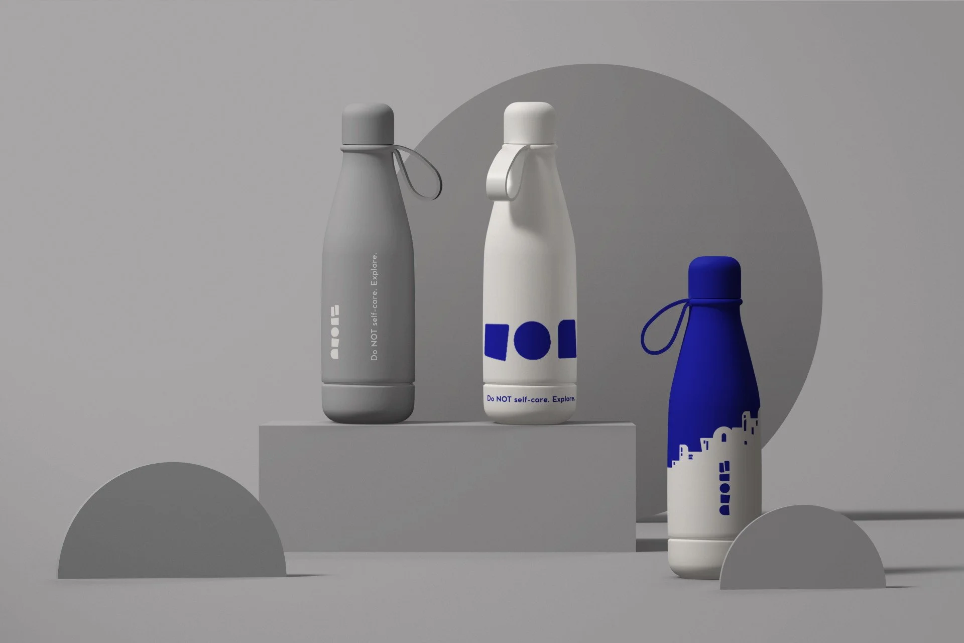
It’s a lifestyle statement - for people who choose simplicity, authenticity, and living fully. -
Define contemporary without chasing trends.
Honor heritage without nostalgia.The brand needed a clear identity - rooted in timeless values, speaking fluently to the present.
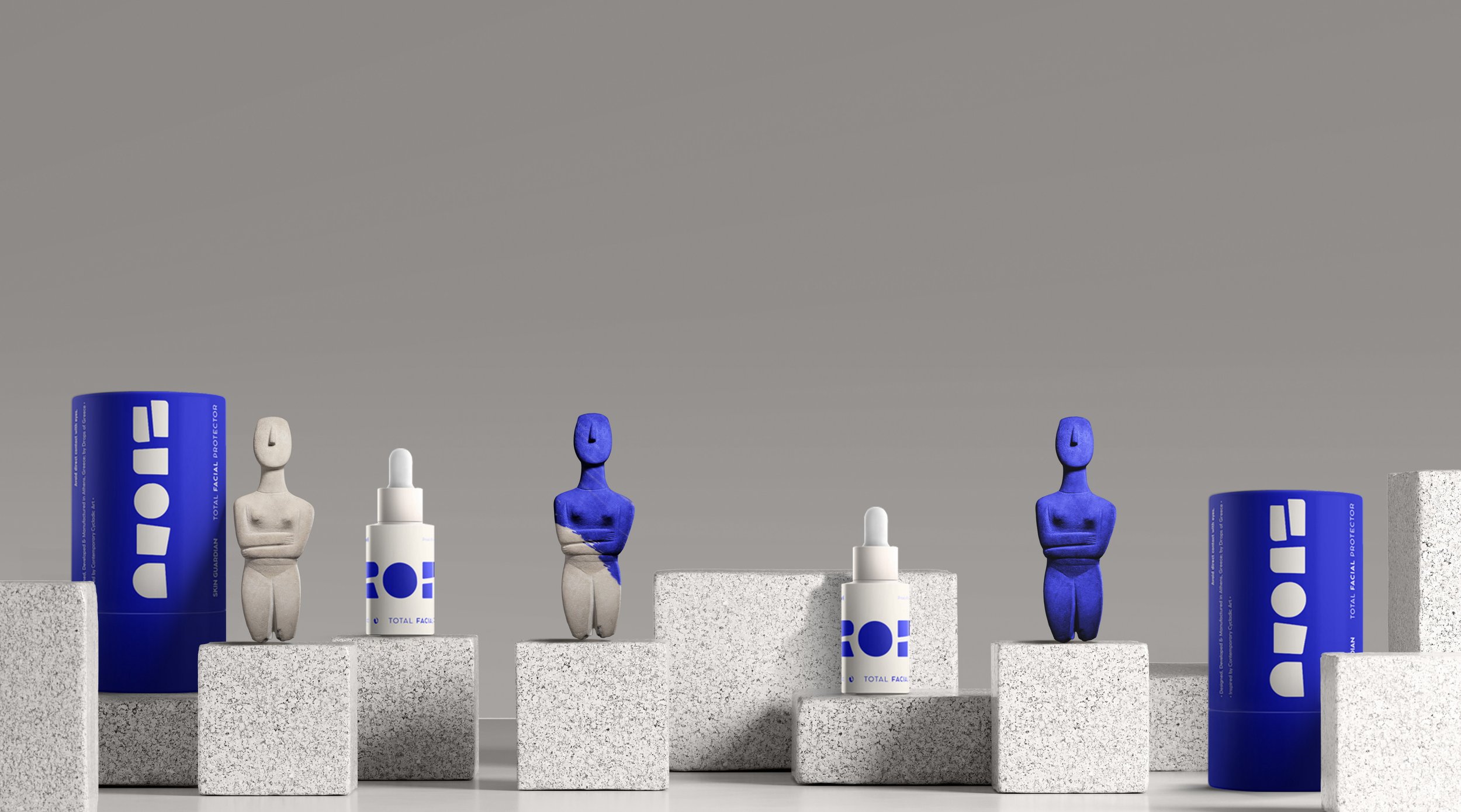
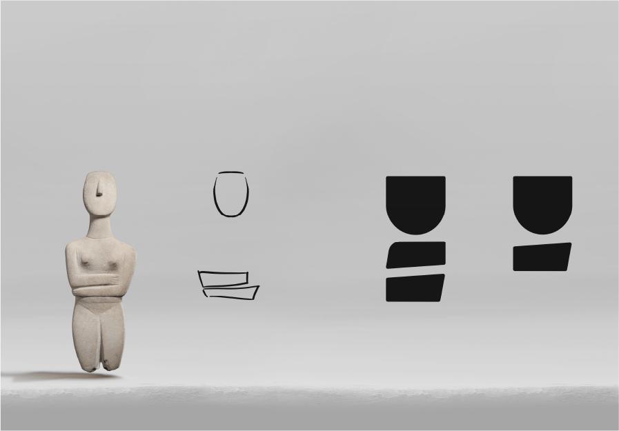
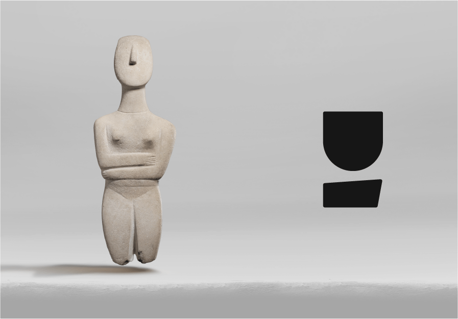
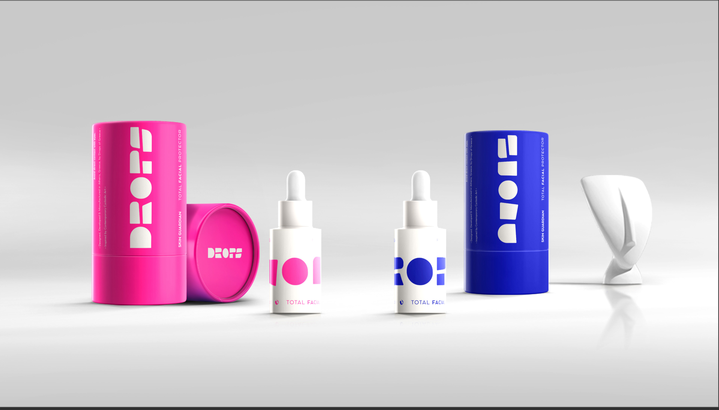
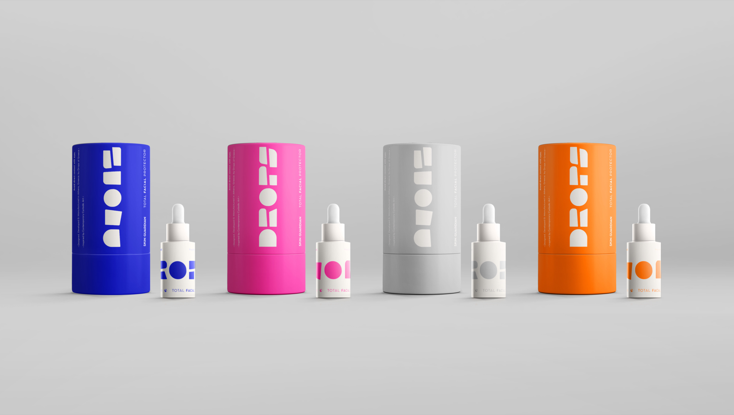
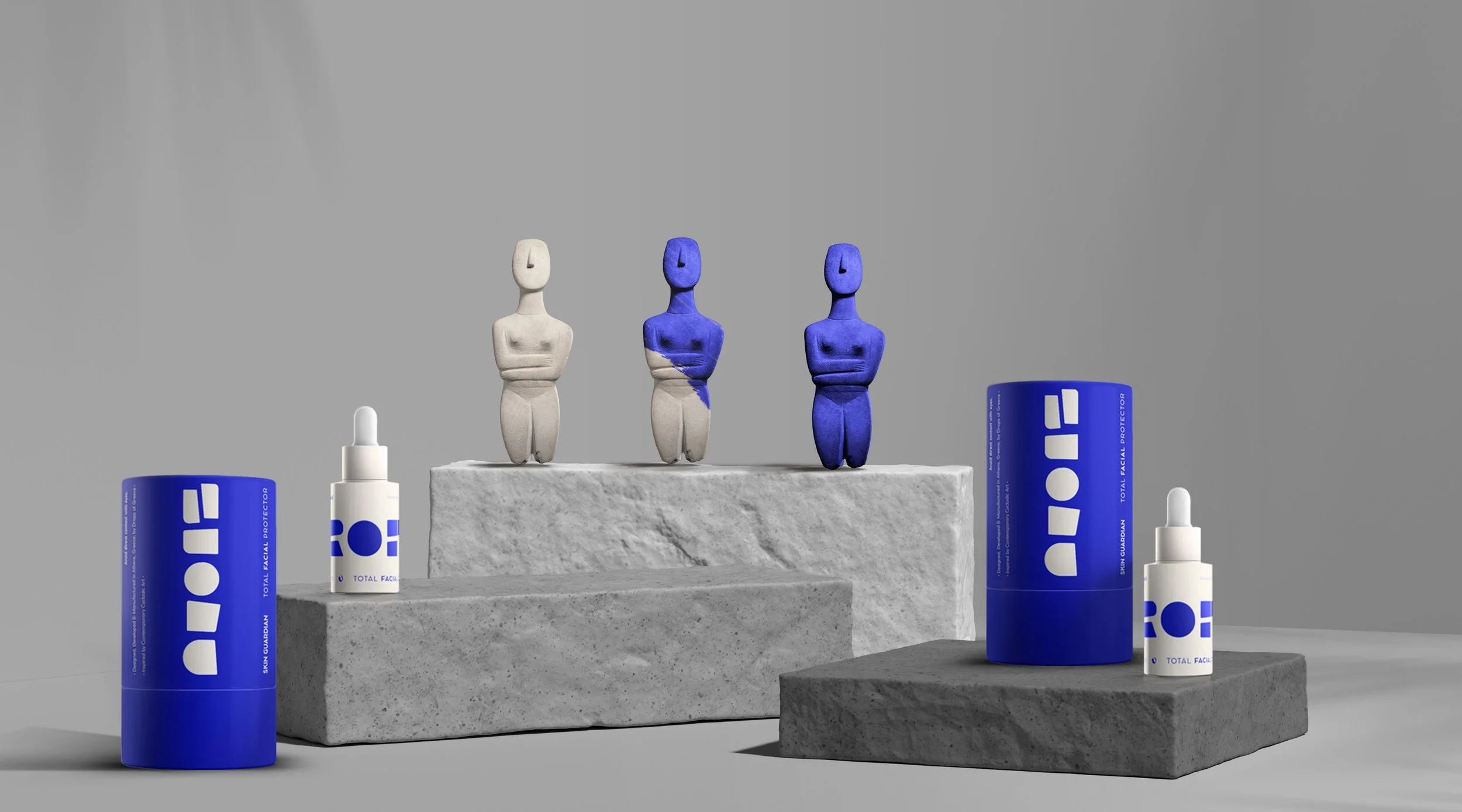
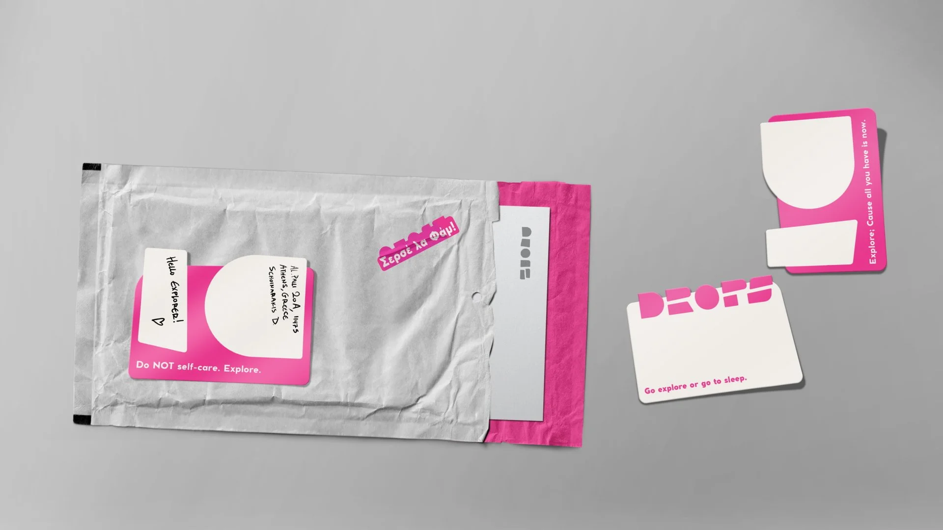
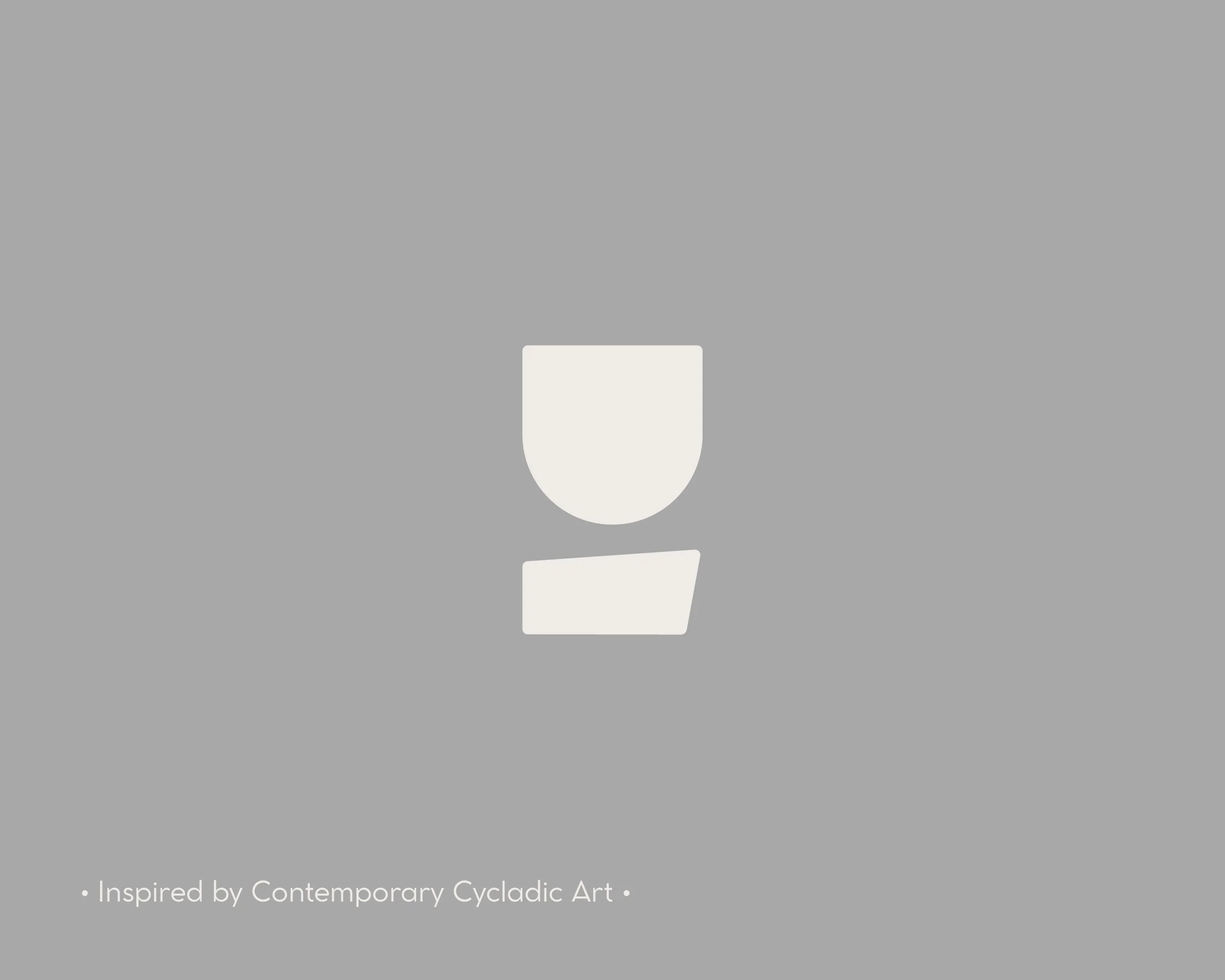
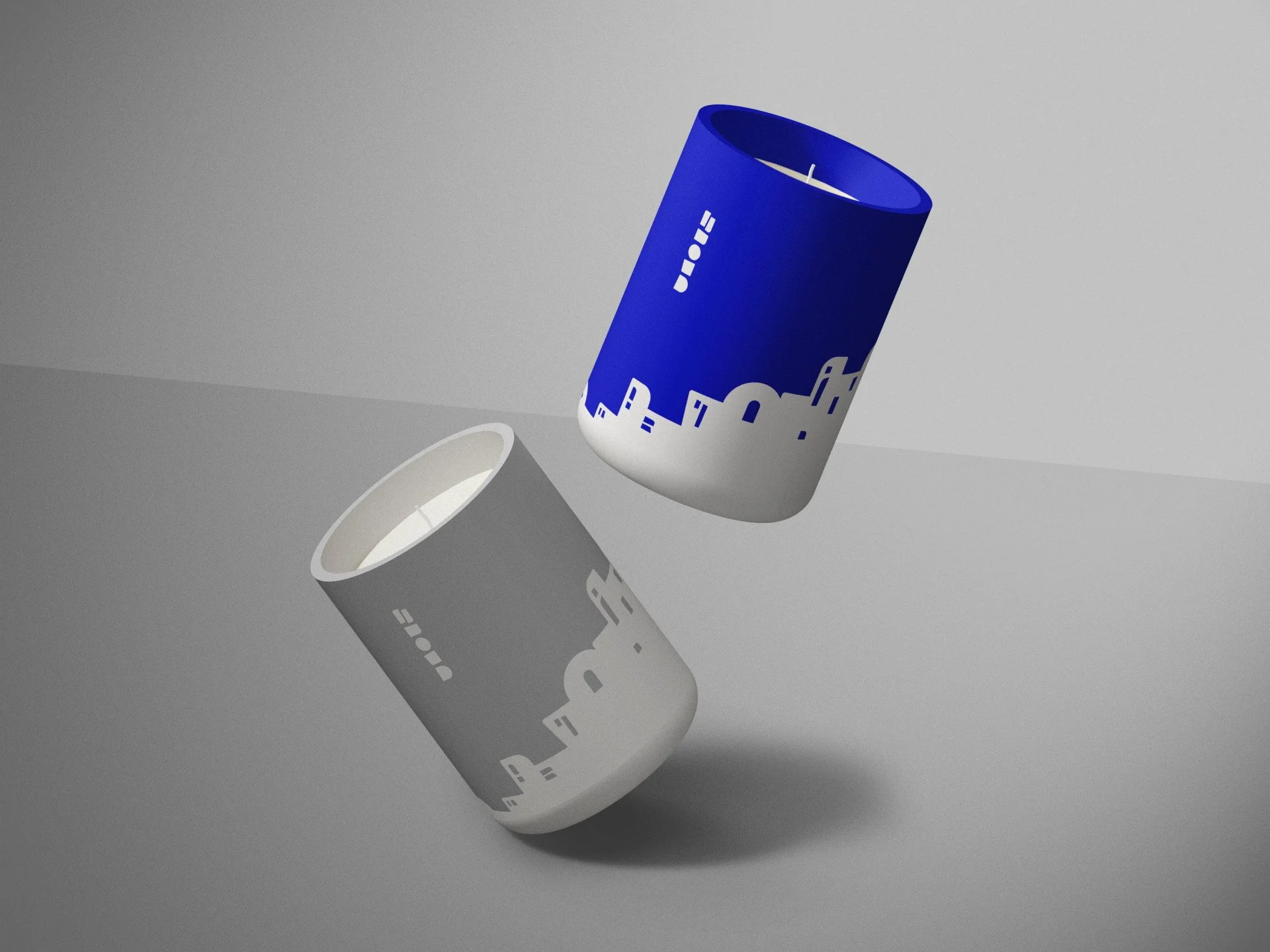
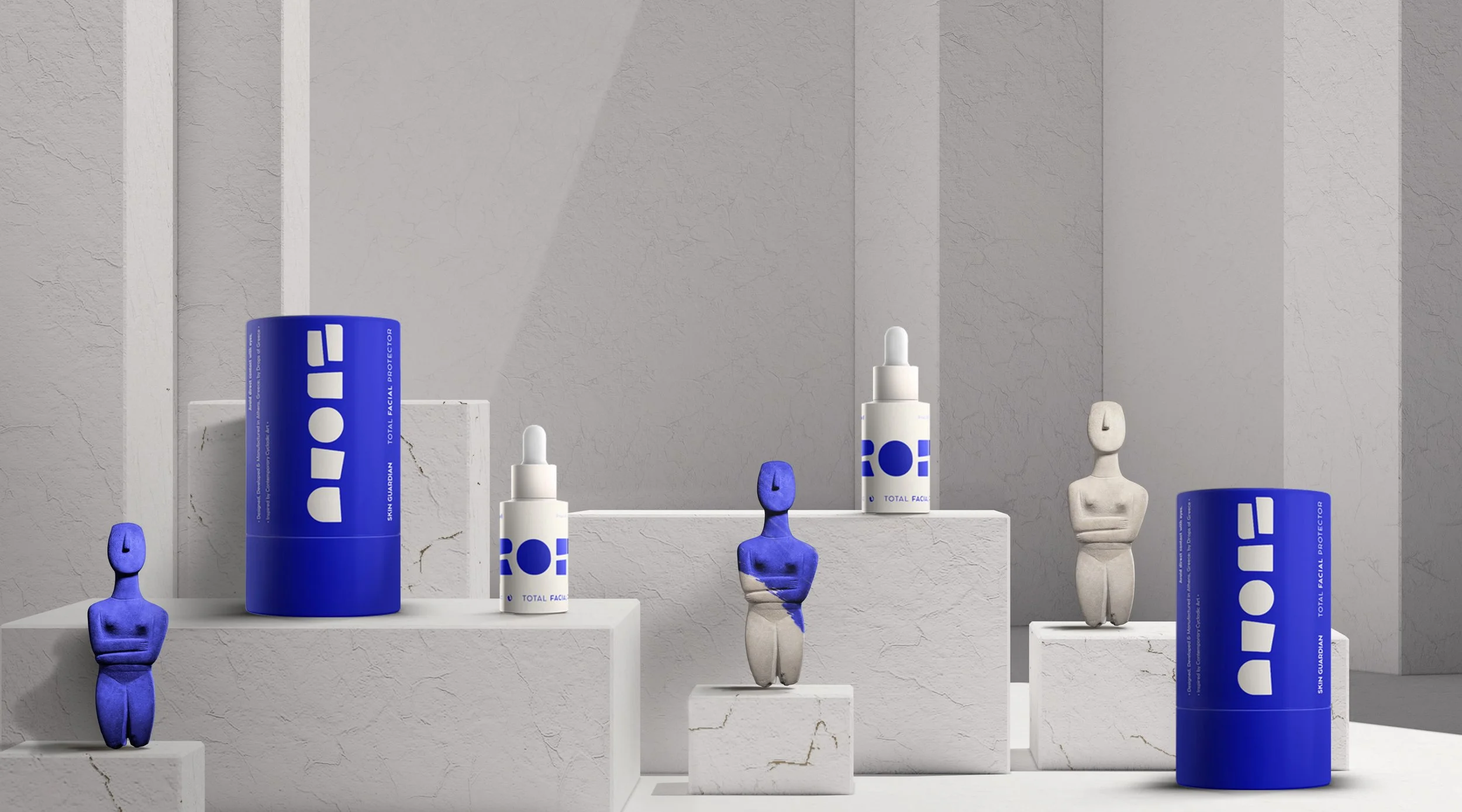
The logo draws from Cycladic marble figurines - pure, abstract, iconic.
We reimagined the torso form, preserving its essence while stripping it down to what matters.Past and present.
Heritage and now.
One mark built to last.The wider identity follows the same rule.
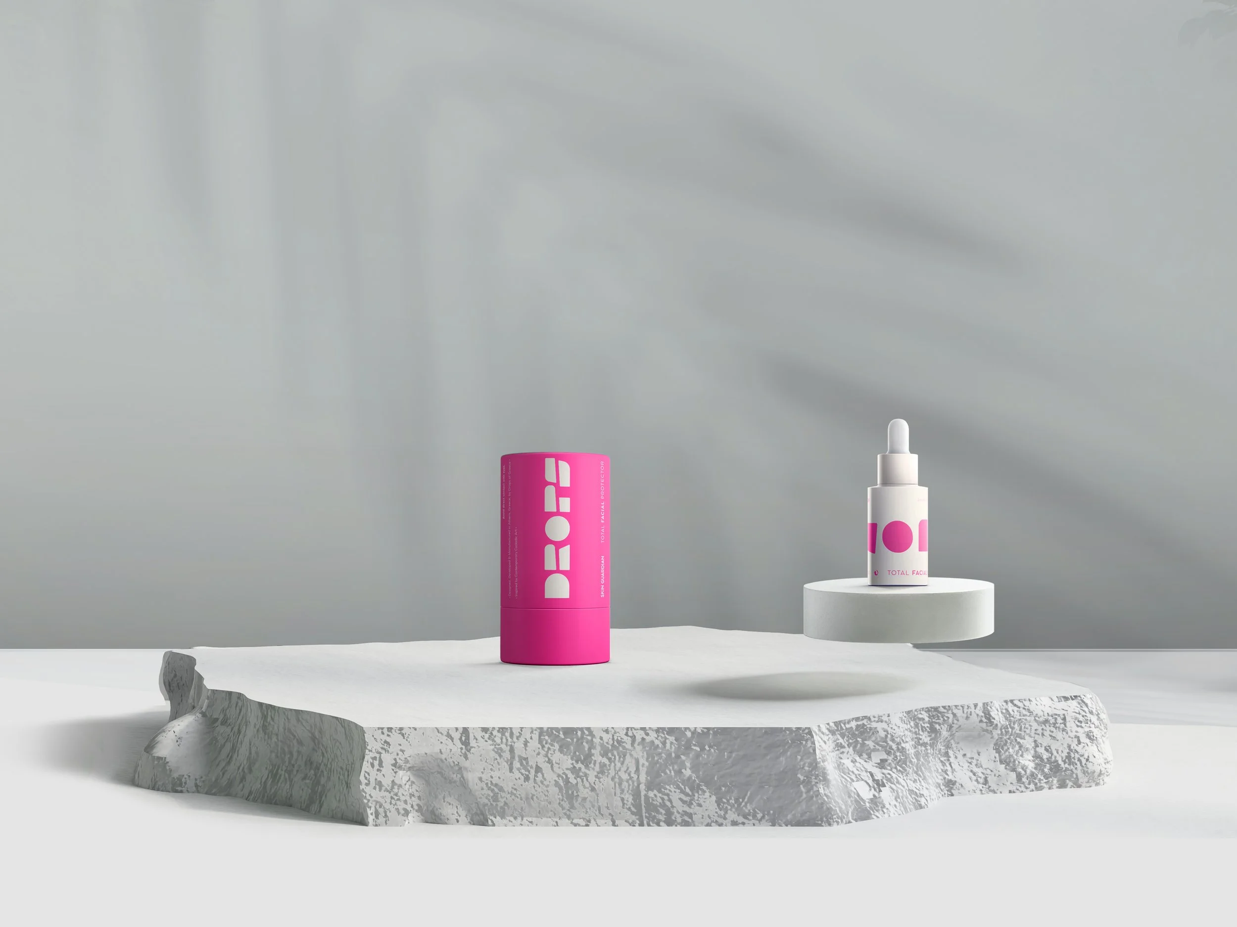
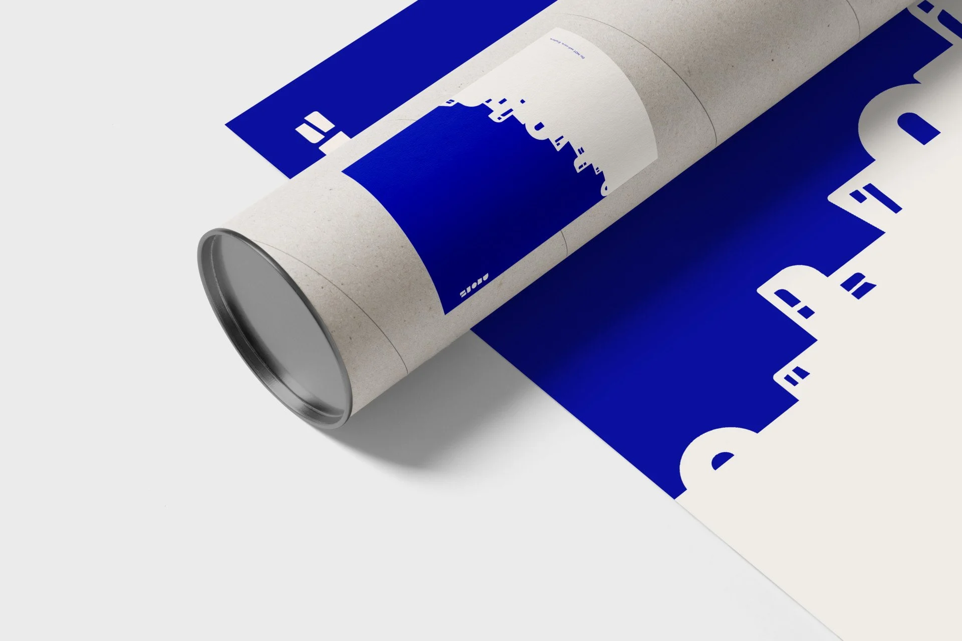
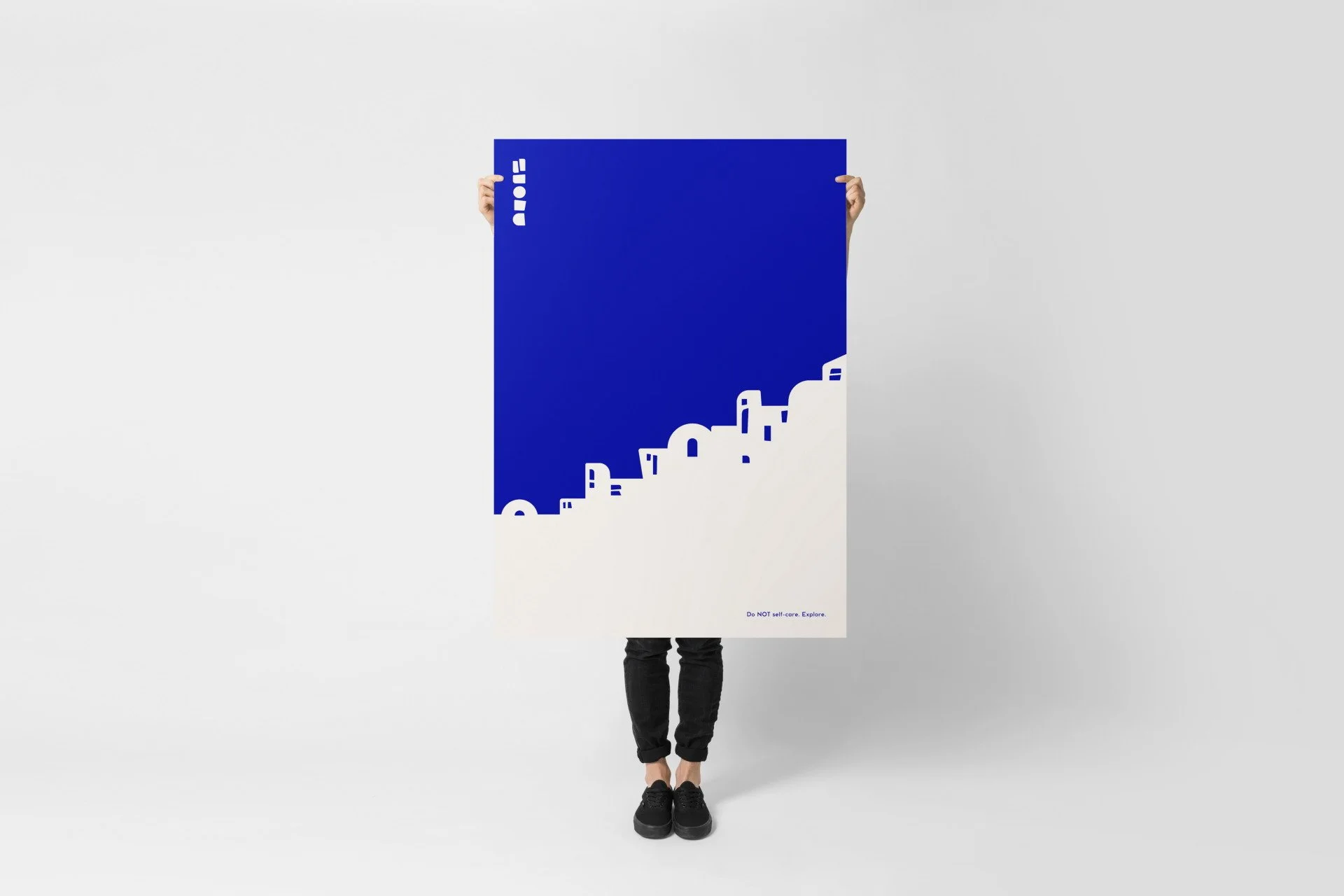
Forms inspired by Cycladic architecture.
Minimal. Sculptural. Modern. -
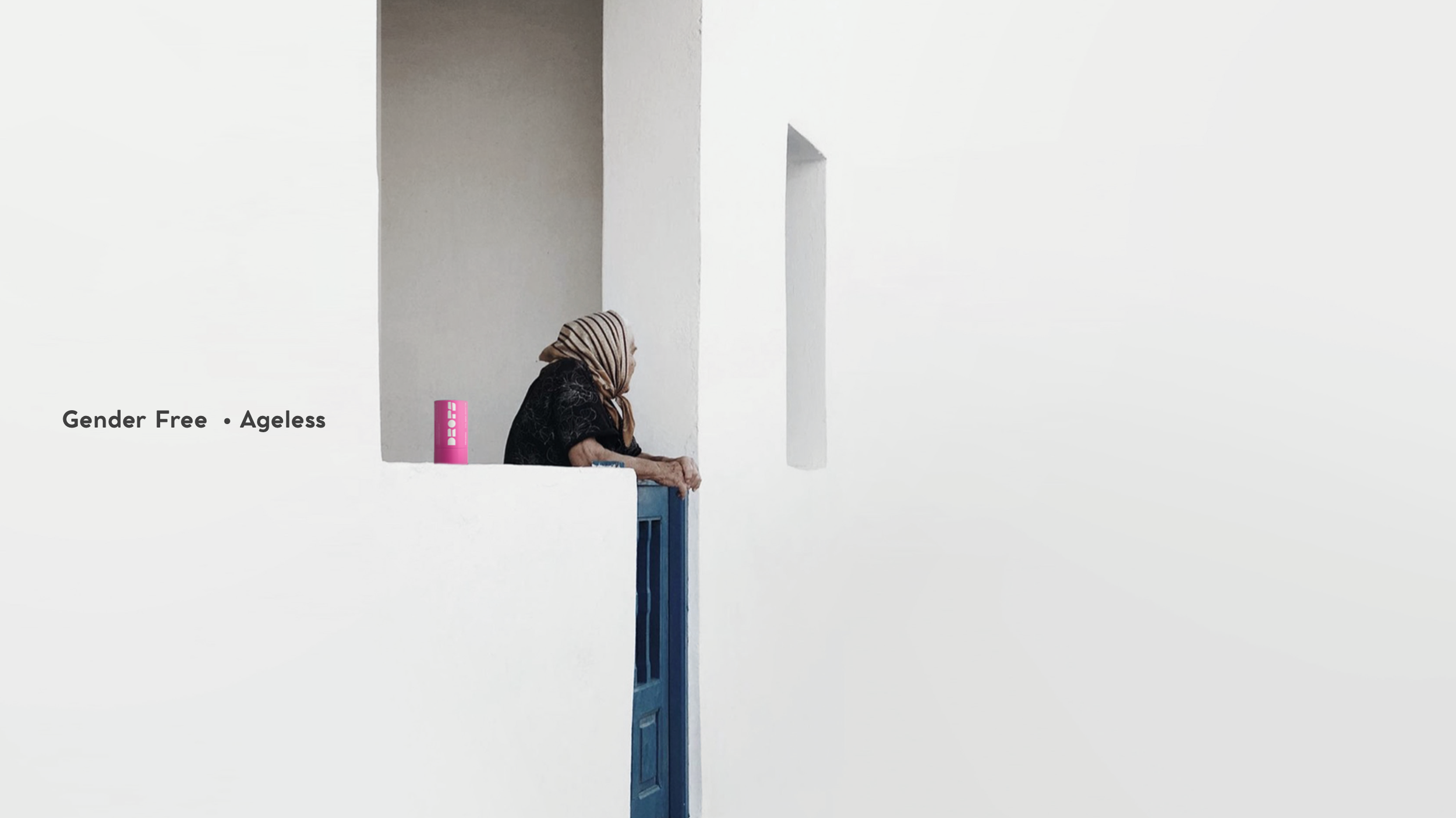
In a screen-saturated world, we chose to build a brand grounded in timeless physical references - materials, forms, and meaning.
Cycladic art became our foundation - not as a museum artifact, but as a living design language:
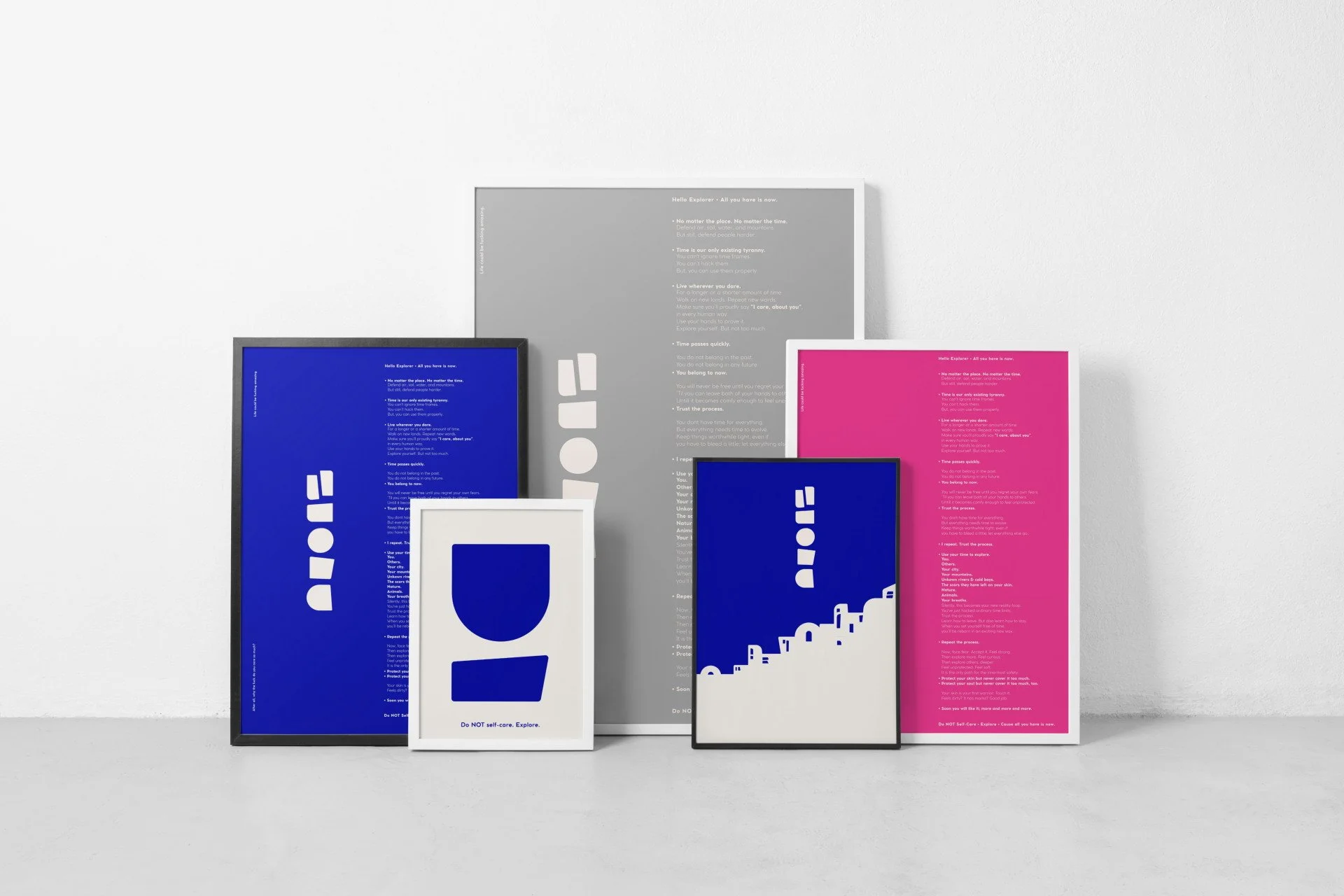
current, urban, and confidently contemporary.Although Cycladic figurines are often perceived as pure white, their creators embraced color with symbolic and practical intent.
Inspired by traditional Cycladic hues - red, blue, yellow, and melano - and the textures of marble and clay, we developed a modern color palette.
Reinterpreted through an urban lens, the palette balances heritage with innovation, restraint with expression.The result: a skincare brand with a strong cultural backbone, a clear point of view, and a visual identity designed to last.